
We research the market,
analyse trends
and share our experience
TOP services for auditing the mobile version of the site

The audit of the mobile version of the site is a very important, but at the same time complex and lengthy process. Modern services can greatly facilitate the audit process and expand the capabilities of site owners. The most popular are Google developments, which include:
- Google Search Console;
- Mobile-Friendly Test.
Using these services, you will be able to find out the level of optimization of the mobile version (in percentage terms), as well as get acquainted with the list of existing problems. In addition to the two main, most popular services, there are several more important tools:
- Mobile SERP Test. Allows you to carry out the most informative ranking of the mobile version of the site, as well as evaluate its appearance on various types of devices.
- Blisk. The presented browser will allow you to view all possible variations of the site's appearance and conduct an independent analysis.
- Mobile First Index Checker. The service is designed to search for inconsistencies between different versions of the site (for PCs and smartphones), it is able to analyze not only the speed of mobile versions, but also determine the amount of metadata, internal links and content in general.
- Adaptivator. A site created for the most informative analysis of mobile versions of sites. Thanks to the service, you can assess all the shortcomings and develop the necessary edits.
Features of audit of the mobile version of the site
Recent studies have shown that more and more people are using different devices to browse the Internet, and certain devices are relevant at certain times of the day, for example, a smartphone while driving to work or a tablet in the evening.
Google also noted that it will prioritize mobile-enabled sites in search results sent to smartphones, thereby ensuring that the most useful set of results is returned to every user.
Differences between specialized and responsive design
A website based on a specialized design adapts to a predefined set of different screen resolutions, that is, each resolution requires a different template. This requires a number of different templates and there is a risk that a new type of device may need a new template to get the best results.
The site is built on the basis of a responsive design, adapts to any screen resolution using only one template. In doing so, it will be built in such a way that elements on the page can resize (using a percentage width) or move as needed. This will provide information in a format that best suits the type of device the visitor is using.
Site visitors are mainly looking for information contained in the main block of pages. For example, if a job seeker enters the word "family lawyer Klimenchuk", it should be immediately obvious that you can actually provide family lawyer Klimenchuk. Any additional calls to action or information should be submitted under this main text block. Mobile users do not need to see sidebars, blog and social media feeds, news and other calls to action; all they need to see is the information they were looking for and a way to get in touch with you.
Council. If visitors cannot find all the information they need on the main page, then make sure navigation is easy to use through the touchscreen.
Make sure your forms are easy to use on a small screen so that your phone number is easy to find and clickable on. Provide a map on your contact page, which works with the Google API, so customers can access the route based on their location.
People who visit the site from a mobile device may be using a weak mobile Internet. If the Internet speed does not reach the 3G level, then the corporate website filled with information and photos will not open or load incorrectly (although it will load quickly on high-speed broadband Internet). Make sure your design takes this into account and your page load speed is optimized for mobile users.
Also make sure the pages are not too long or they will load slowly and make users scroll endlessly to find the information they want.
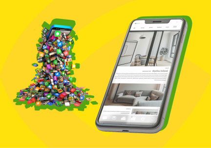
Website development for the Polish market!

We are your reliable partner in setting up and developing your business in Poland. Our company offers a full range of services for the launch and successful operation of your company in this country. We specialize in the development of websites in Polish, adapted to the needs of the local audience. Our web development professionals have many years of experience in designing and optimizing websites for the Polish market, which will allow your business to compete effectively and attract customers.
Our services include:
- Polish website development: Our website development professionals will create an effective and attractive Polish-language website for you that will attract the attention of local customers.
- Marketing services in Poland: We will develop a marketing strategy for you that will allow you to set up effective advertising campaigns and attract your target audience.
- Rebranding your business: Our rebranding experts will help you update your company's image and emphasize your strengths to attract new customers.
Cooperation with us covers a wide range of services for entrepreneurs and companies expanding their activities in the international market. We offer professional translation of documents and information, advice on local banks and financial procedures, assistance in registering a business and opening a branch, as well as support in choosing a payment and delivery system. In addition, we can provide you with contacts for registering a legal entity in Poland, office selection, accountant contacts and other services. We make sure that your business initiatives are successfully implemented in the new market conditions.
Address of the office in Poland: Biuro 315, Regus Equal Park 3rd Floor, Wielicka 28, 30-552 Kraków
Don't waste time - choose our company for a successful start in Poland. We know how to make your business competitive in this market!
For a successful start in Poland, please contact us:
📞 Phone: 0 (800) 750-751
📧 E-mail: [email protected]
How a website audit can transform your business

A website audit is not a simple check, it is a necessity that allows you to deeply understand both the technical and marketing aspects of your site. Is your website optimized for search engines? Does it communicate effectively with your potential customers? The answers to these questions can radically change your approaches and strategies. Ordering a website analysis can reveal hidden issues that are holding back your site's lead generation and customer acquisition potential. Whether you're looking to improve your site's search engine rankings or increase user satisfaction, an audit can provide you with the tools and guidance you need.
We will look at how a carefully prepared audit can significantly improve your website and make it more competitive. We will discuss what aspects of a website are checked during an audit, what benefits it can bring to your business, and how you can order a website audit from professionals to ensure the best results.
Why does your business need a website audit?
Excellent website usability is not just a nice bonus, but a critical condition for ensuring online success. A website audit allows you to analyze in detail how conveniently and efficiently users interact with your site, and how this affects your business's ability to achieve its goals. Here are some reasons why it is important:
- Increase user satisfaction: An audit reveals navigation and interface issues that may prevent users from easily and intuitively finding the information they need or performing the actions they want on your site. Improving these aspects can significantly increase your visitors' satisfaction.
- Reduce bounce rate: When users find it difficult to navigate the site or perform the necessary actions, they are more likely to leave the site without converting. An audit helps to identify and fix design elements that can lead to a high bounce rate.
- Increase conversions: Website optimization can have a direct impact on your conversions. For example, simplifying the checkout process or improving the visibility of a call-to-action button can significantly increase the number of successful transactions.
- Search engine optimization: SEO audit and optimization is part of the overall website audit and focuses on aspects that affect your website's visibility in search engines. Analyzing keywords, meta tags, URL structure, and other SEO practices will help to push your website higher in search results.
- Improving accessibility: The audit also assesses how accessible your site is to people with disabilities. Ensuring accessibility not only expands your target audience, but also emphasizes your responsibility as a business.
- Optimization for mobile devices: Nowadays, it's important that your website is optimized for mobile users. An audit will help ensure that your website works efficiently on all types of devices, improving the overall user experience.
Ensuring a high quality website is an investment in customer satisfaction and the efficiency of your online space. Ordering a professional audit can help you identify critical issues and resolve them before they negatively affect your business. You can read more about SEO promotion in the article "Features of SEO optimization of an online store"
How the audit is conducted and what we offer
Website audit is a complex process that includes several key stages. Each stage has its own specifics and requires a detailed approach. Our team of specialists uses advanced technologies and techniques to ensure the highest quality of services. This is how we work:
- Audit planning: First of all, we identify your business goals and website features. This helps us to prepare a personalized audit plan that takes into account all the necessary aspects: from technical analysis to user experience assessment.
- Technical audit: At this stage, we check the technical component of the website: coding, information architecture, compliance with SEO and web accessibility standards. We identify technical errors that may prevent the site from being indexed by search engines or impair overall performance.
- User experience (UX) audit: We analyze how visitors interact with your website and evaluate the usability of the interface. In this context, we can also put a heatmap on the site. Heatmaps allow you to visualize where users click most often, how long they stay on certain segments of the page, and how they scroll through the page. This is very useful for improving page structure and content.
- Report and recommendations: At the final stage, we compile a detailed report that includes all the issues we found and specific recommendations for fixing them. We provide practical advice that can be implemented quickly to improve your website.
- Support and optimization: After the audit, we also offer website maintenance and optimization services. This can include regular updates, monitoring of website performance, and additional checks for compliance with changed requirements or technologies.
Our goal is not just to identify problems, but to provide you with the tools and knowledge to solve them effectively, so that your website not only works at full capacity, but also helps you grow your business.
Glyanec provides professional website audit services that include technical audit, usability testing, SEO optimization, and analysis of your website's accessibility and security. We use advanced tools, such as heatmaps, to analyze user behavior in depth, allowing us to offer targeted and effective solutions for each client.
If you want to ensure that your website functions at the highest level, meets all modern requirements, and works as a powerful tool for your business, contact us. Order a website audit in Glyanec today and take the first step towards improving your online space. We guarantee a professional approach and dedication to achieving your business goals.
What are the advantages of websites over mobile apps?

Different companies are faced with the choice between developing mobile apps and websites every day. While mobile apps may seem convenient and innovative, it's important not to ignore the numerous advantages of websites. Ordering a website is not just an investment in an online presence, but a strategic decision that can significantly reduce development and maintenance costs, provide a wider audience reach, and improve search engine rankings.
We'll take a closer look at why websites compare favorably to mobile apps, analyzing their functionality, accessibility, and maintenance costs. The importance of websites in today's digitalized landscape cannot be underestimated, as they play a key role in attracting customers, expanding the market, and optimizing the user experience.
What is a website and a mobile application?
Websites and mobile apps play vital roles in promoting a business, but they have significant differences. A mobile app is a program downloaded and installed on a mobile device that can use the phone's system capabilities, such as a camera, GPS, or gyroscope. They can offer a more personalized experience, but they require significant investment to develop and maintain.
Therefore, choosing between website development and in-house development usually turns out to be a more profitable and effective solution.
Main advantages of websites
Websites offer a number of benefits that make them an attractive choice for businesses of all sizes. Let's take a look at a few of the key benefits you should consider when considering a website for your business.
- Universal access: One of the main advantages of websites is their accessibility. Visitors can access your site from any device that has an Internet connection, regardless of the operating system. This provides a wide audience reach and the ability to attract more potential customers.
- Cost-effectiveness: Ordering a website is often much cheaper than developing a mobile app. The cost of developing and maintaining a website is lower because you don't need to create separate versions for different platforms, such as iOS and Android. In addition, updates and changes to the site can be implemented faster and easier, which reduces overall maintenance costs.
- SEO and marketing benefits: Websites provide better opportunities for search engine optimization (SEO). This means that your website can rank higher in search engines, increasing the chances of being discovered by potential customers. Optimizing your website for search engines helps to increase its visibility and attract more organic traffic.
- Improving the user experience: Websites can offer a rich and user-friendly user interface that is adapted for different devices, including mobile phones, tablets, and desktops. With a responsive design, users can easily navigate the site, which improves the overall user experience and can increase conversion rates.
With these benefits in mind, building a website is a rational choice for businesses looking to maximize the benefits of their online presence. Not only do websites save money and resources, but they also provide ample opportunities to scale and grow your business.
Why do users abandon mobile apps?
Despite the significant development of mobile technology and the increase in the number of available apps, many users still prefer websites. This is due to a number of reasons that point to certain disadvantages of mobile apps and limitations that can affect the user experience.
Most users do not see the need to install mobile applications when they can easily access the same services or information through a website on their laptop or smartphone via a browser. This is especially true for those services that users use infrequently or sporadically.
Additionally, users emphasize that mobile apps often take up too much space on their devices, which can be critical for those with limited storage space. There are also concerns about battery and mobile data consumption, especially when apps are running in the background or transferring large amounts of data.
Privacy and security issues
One of the biggest concerns that pushes users away from mobile apps is the issue of privacy and security. Many apps require extensive permissions to access personal information such as contacts, location, social media data, and even personal files, which raises concerns among users about how this data is collected, stored, and used. There is also a fear that mobile apps may be vulnerable to hacking, especially those that store sensitive financial data or personal information. Data breaches at large companies that have made headlines only reinforce these concerns.
These factors contribute to the fact that many users prefer to use websites that do not require a download and provide quick access to services without the need to install resource-consuming applications. This confirms that websites can be a more convenient and secure solution for many users. However, for many companies, creating a website will prove to be the most optimal solution to effectively attract customers and provide high quality service with minimal costs and complexity.
To summarize, a careful choice between website and mobile app development should be based on the specific needs of the business, its target audience, and available resources. However, for many companies, ordering a website will prove to be the most optimal solution that allows them to effectively attract customers and provide high quality service with minimal costs and complexity.
What are progressive web applications and what are their advantages

Progressive Web Applications (PWAs) are changing the way we think about what websites can do. This technology combines the best of the web and mobile applications, offering speed and usability that was previously only possible in apps. In this article, we'll take a closer look at what progressive web apps are, what technologies are behind them, their benefits, and key implementation considerations. We will pay special attention to how progressive web applications can transform your business by providing a better user experience and increasing productivity.
What are progressive web applications?
Progressive web applications are a type of software that is split into a website and a mobile application. This allows users to install web applications on their devices and use them in a similar way to regular mobile applications. An important feature of PWAs is that they use web browser technologies but offer functionality that is usually associated only with mobile applications.
The PWA concept was first introduced by Google in 2015. The goal was to make the web experience as convenient and fast as possible. Since then, the technology has gained significant development and support, especially from companies seeking to improve the mobile user experience without losing the versatility and accessibility of the web.
Technologies used in advanced web applications
Progressive web applications use a number of modern web technologies to provide users with an experience that is as close as possible to mobile applications. The most important of these technologies are:
- Service Workers - scripts that run in the background, independently of the web page, and allow you to manage network requests, cache resources, and use push notifications.
- Manifest file - a JSON file that allows developers to install a web application on the home screen, set the icon and the start screen.
- Using HTTPS - ensuring the security of user data and the reliable operation of web applications.
Why progressive web applications are better than traditional sites
Improving the user experience
Progressive web applications are characterized by extremely fast loading speeds and high responsiveness, which is ensured by data caching and intelligent management of network requests. This means that users are able to access content instantly, regardless of the quality of their Internet connection, which significantly improves the overall user experience.
Offline access and support for push notifications
One of the defining features of PWA is the ability to work offline. This is achieved thanks to Service Workers technology, which allows web applications to cache important content and provide access to it without the need for an Internet connection. In addition, PWAs can use push notifications to inform users about news, updates, or special offers even when they are not using the web application.
Increase engagement and conversion rates
Thanks to better user experience and offline capabilities, PWAs demonstrate high rates of user engagement and increased conversions. The ability to load quickly and run smoothly on any device ensures higher customer loyalty and a higher likelihood of completing targeted actions, such as making a purchase or filling out a contact form.
Steps to implement progressive web applications in your business
Implementing progressive web applications may seem daunting, but with the right approach, the process can be efficient and smooth. Here are the basic steps to integrate PWA into your business:
- Audit the current state of the website - check if your site is ready for conversion to PWA. This includes ensuring HTTPS compatibility, site responsiveness on different devices, and the availability of all necessary technical aspects.
- Developing and configuring Service Workers is a key component of PWA that allows the website to work offline and use push notifications.
- Creating a web app manifest - a manifest allows users to add your app to the home screen of their devices, providing easier access and a more native experience.
- PWA testing - ensure that your PWA works properly across all devices and browsers, with special attention to offline mode and loading speed.
- Monitoring and updating - once your PWA is up and running, it's important to keep it up to date and make updates to resolve any issues or improve functionality.
To illustrate how easily and quickly users can install a progressive web application on their devices, we have prepared an animated GIF. This GIF shows the process from the moment a user visits a website to the moment they install the web application on the home screen of their mobile device. This demonstrates the simplicity and ease of use of PWAs, as well as their ability to offer a native experience through a web browser.

Progressive web apps are a powerful tool for business development, offering speed, convenience, and an enhanced user experience comparable to native mobile apps. They allow you to achieve a high level of customer engagement, provide the ability to work offline and send push notifications, which is critical in today's dynamic market. Thanks to their ease of installation and efficiency, PWAs can significantly increase conversion rates and improve the overall user experience.
If you're looking for a way to make your web experience more efficient and engaging, progressive web applications can be a great solution. Remember that proper implementation and ongoing updates are essential to the success of any technology solution. Don't hesitate to bring in professionals to help you optimize your website to turn it into a responsive web app and take full advantage of its capabilities.
Virtual fitting rooms in online stores: how artificial intelligence is changing shopping

In a world where technology is changing every aspect of our lives, online shopping has become one of the fastest growing areas. However, despite all the convenience that shopping from home offers, there is one problem that still makes many shoppers hesitate before clicking the "buy" button: the inability to try on clothes before buying. This is where innovative technologies, such as virtual fitting rooms, come into play, promising to revolutionize the way we buy clothes online.
Virtual fitting room is a cutting-edge technology that uses artificial intelligence and machine learning to allow customers to try on clothes virtually before making a purchase. This innovation has the potential not only to provide a better online shopping experience, but also to fundamentally change the entire retail sector.
Our company is closely monitoring this area of technology and expects its rapid development in the near future. We believe that the integration of such innovations will not only increase customer satisfaction, but will also significantly improve the efficiency of online stores by reducing the number of returns due to mismatched sizes or appearance of goods.
Evolution of virtual fitting rooms
From early experiments to today's advanced systems, virtual fitting rooms have come a long way. Initial attempts to implement digital solutions for trying on clothes were criticized due to poor visualization quality and limited functionality. However, with the advent of advanced artificial intelligence technologies and improved image processing algorithms, virtual fitting rooms are becoming much more accurate and useful for the end user.
The key to the success of virtual fitting rooms lies in the use of a range of technologies. This includes computer vision, artificial intelligence, machine learning, and image processing algorithms. These technologies allow to analyze users' photos in real time, adapting clothes to their body parameters. In addition, advanced interfaces ensure that these systems are intuitive and easy to use.
Benefits for consumers and businesses
Virtual fitting rooms offer significant benefits for both customers and store owners. For consumers, it is an opportunity to visually assess how the clothes will fit them without having to visit a physical store or wait for the goods to be delivered. This significantly increases customer satisfaction and reduces the number of returns. On the other hand, retailers are able to attract more customers by offering a unique shopping experience and reduce the costs associated with handling returns. As a result, virtual fitting rooms not only boost sales but also improve business sustainability.
Online fitting - how does it work?
Integrating a virtual fitting room into a website requires a comprehensive approach that includes the development or implementation of specialized software. This software uses artificial intelligence algorithms to analyze user-entered data, such as body measurements, or even real-time photos or videos to create an accurate virtual image on which to "try on" clothes.
Artificial intelligence plays a key role in the functioning of virtual fitting rooms, as it analyzes and processes user data to create an accurate three-dimensional model. Such systems can recommend the most suitable size of clothing, taking into account not only the size but also the personal preferences of users regarding the fit of clothing. The introduction of virtual fitting rooms is changing not only the way people buy clothes, but also the overall online shopping experience. Customers are able not only to visually see how the clothes will look on them, but also to experiment with different styles and colors without the need to physically visit the store. This interactive approach can greatly enhance the user experience, increasing shopping satisfaction while reducing the likelihood of returning an item due to a failure to meet expectations.
Advantages of online clothing fitting
The use of online clothing fitting technologies brings significant benefits that affect both the consumer experience and the efficiency and sustainability of retail business models. Let's look at the key aspects of these benefits:
Reducing the number of product returns
One of the biggest challenges for online retailers is the high number of returns, which is often due to mismatches in sizing or customer expectations of how the product looks. Online clothing fitting can significantly reduce this risk by giving customers a better understanding of how the clothes will fit them, which in turn leads to more confident purchases and fewer returns.
Increasing customer satisfaction and loyalty
Enhancing the online shopping experience through a virtual fitting room helps to increase overall customer satisfaction. Interactivity and personalization of purchases strengthen the relationship between brands and their customers, encouraging repeat purchases and increasing loyalty.
Impact on environmental friendliness and business sustainability
Reducing the number of returns not only improves economic efficiency for businesses, but also has a positive impact on the environment. Reducing the need to transport returned goods helps to reduce the carbon footprint of companies, making them more sustainable and environmentally responsible.
The future of the fitting room for an online store
One of the main trends is to improve the accuracy and interactivity of virtual fitting rooms through the expanded use of artificial intelligence and machine learning. This includes the development of algorithms that can analyze the more subtle nuances of users' figures, as well as integration with virtual and augmented reality to create a more immersive fitting experience.
Artificial intelligence not only improves virtual fitting rooms, but also opens up new opportunities for personalizing fashion offers. This can include automatic clothing recommendations based on previous purchases, lifestyle, and personal preferences, which will significantly improve the user experience and shopping efficiency.
By closely following these trends and actively experimenting with virtual fitting rooms, our company strives not only to optimize our customers' experience, but also to act as an integration leader in the market. Recognizing the importance of these innovations, we are confident that the further introduction and development of virtual fitting rooms will not only contribute to the growth of our company, but will also play an important role in shaping the future of online retail by making shopping more convenient, personalized and sustainable.
Just one step to your perfect website


